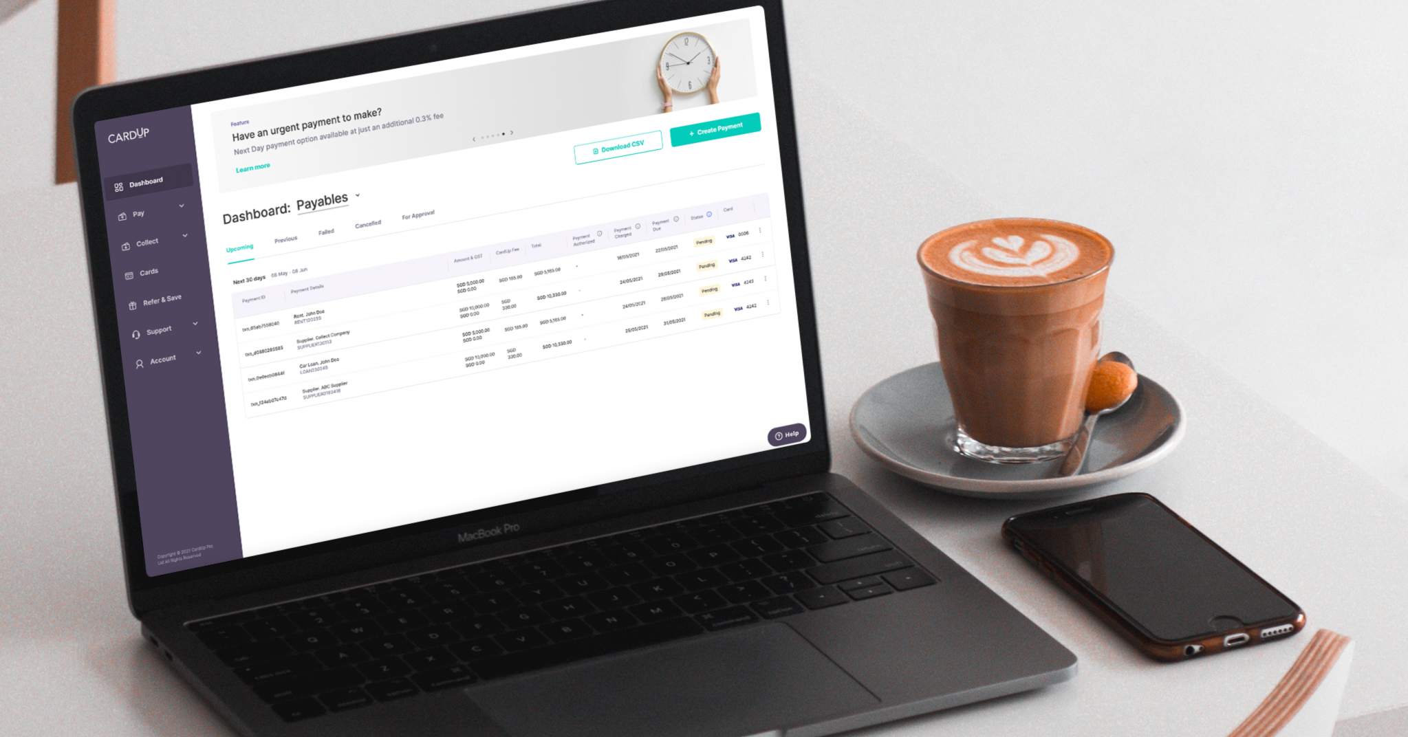
We launched CardUp in 2016 determined to let our customers in Singapore get more from their credit cards, enabling the earning of card rewards on large, recurring payments where they couldn't previously. Payments like rent, insurance, school fees and taxes were previously still made by cash, cheques or bank transfers – and we set out to change that.
Over the last 5 years, we've grown and evolved with the support of our customers towards our mission of providing individuals and businesses with a better way to pay and get paid. This includes helping thousands of businesses tap on an available line of credit they have sitting in their pocket today (their card) to pay any expense from payroll to tax and supplier payments, improving their cash flow. We also launched CardUp Collect so that businesses of all sizes can get paid digitally with our no-code payment gateway.
On top of these products, we layered on software that equips business with the tools their need to automate payment processes from end to end.
But we’re not stopping there! We expanded the business regionally in 2020 and have continued to roll out more products and features that deepen the way we deliver value to you. As we increase our product range, we want to ensure that our platform continues to simplify the lives of our customers, and have therefore redesigned it to keep true to our mission and promise!
Designing with you in mind
Our platform’s been redesigned head-to-toe, taking your feedback to deliver an even more user-friendly and intuitive experience with more features for you to use and love.
Rest assured that your account or scheduled payments will not be affected in any way. You can continue using our platform on the same account, with your past and upcoming payments all found in the same places. It’ll just be easier for you to set up new and edit existing ones!
Clearer navigation
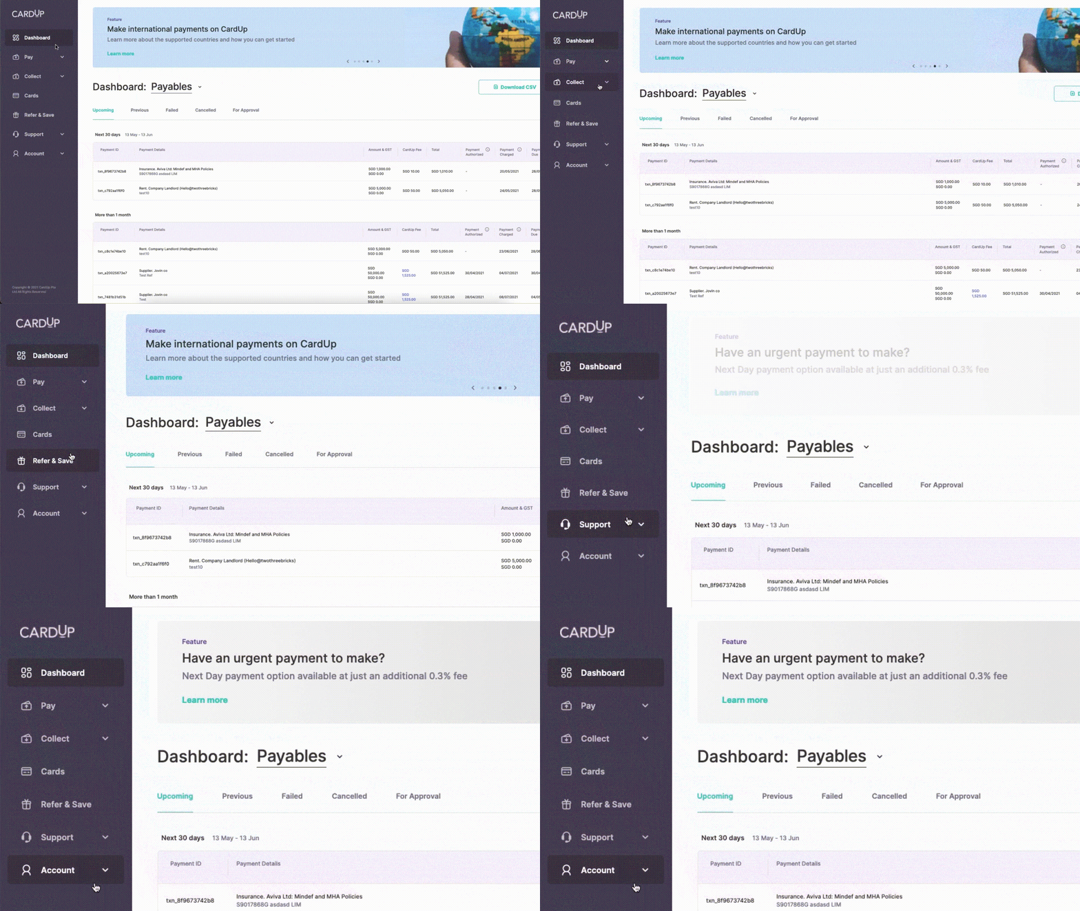
The first thing you'll notice is a completely redesigned look and feel of our platform while keeping the main essence intact. You'll find the navigation bar neatly placed to the left of your screen, giving quick access to everything that’s important to you, such as the dashboard, account settings and referral codes.
Improved payment flow
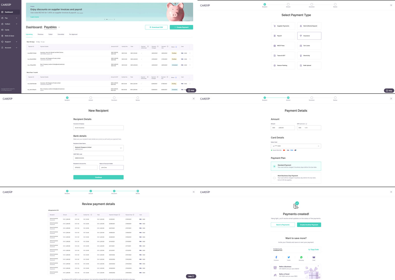
Set up payments now with even fewer clicks! We've spoken to hundreds of customers and with those learnings, refreshed the way you set up your payments on our platform. With larger, visual buttons and even clearer input fields, setting up payments are now even simpler than before.
Smoother document uploads
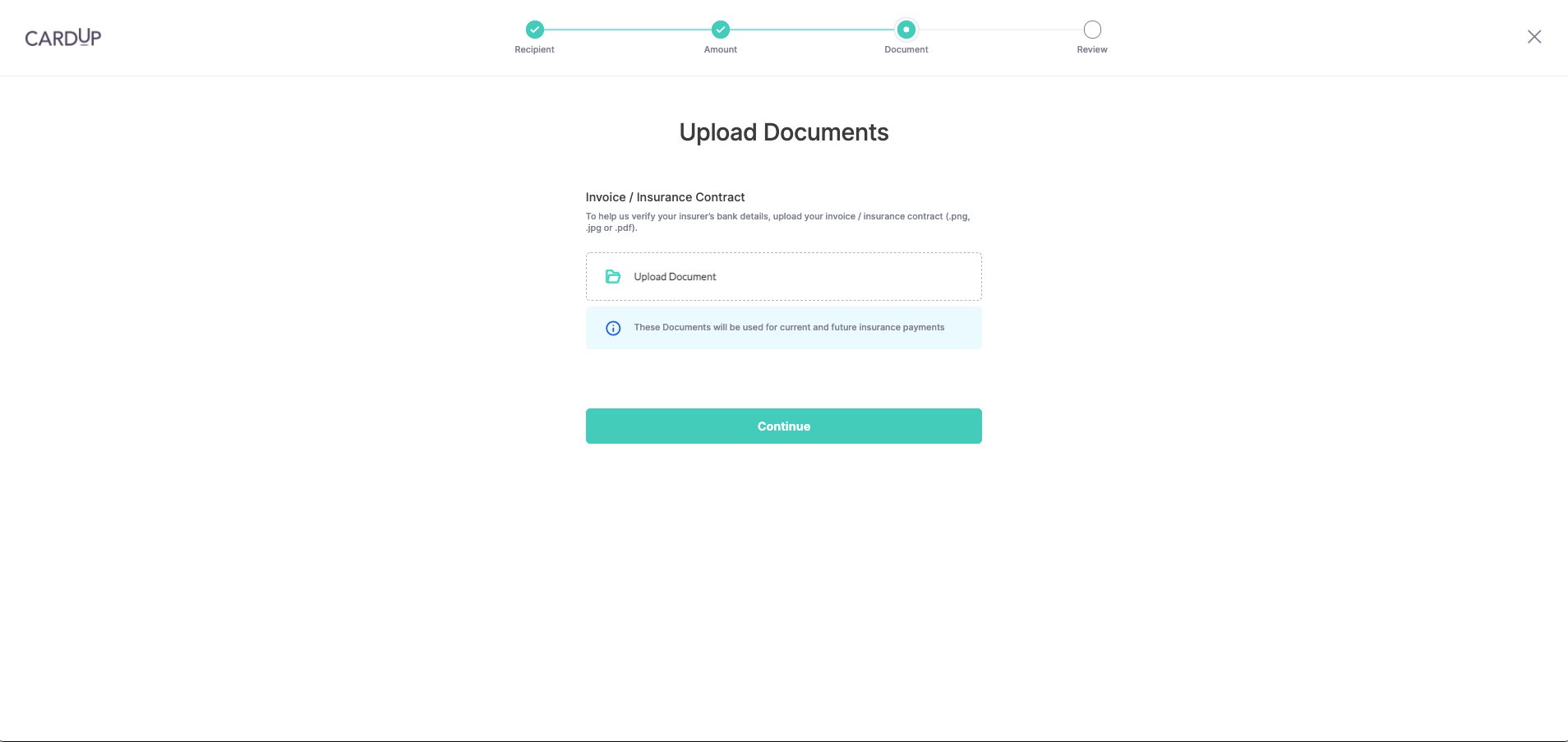
We hear you that uploading documents for compliance and verification procedures can be painful! As such, we’ve improved the user experience on our document upload process, letting you upload all the required documents in one simple step.
Tell us what you think!
Log in now to experience the new CardUp for yourself!

Share feedback and stay updated with us on email and our social media platforms as we showcase more about these new and upcoming features. If you have any questions, you can always check out our FAQs or contact us directly.
